給初學者的 Python 網頁爬蟲與資料分析 (5) 資料分析及展示
這篇文章會示範簡單的統計分析 (平均值與相關係數) 與資料視覺化 (histogram 與 scatter plot),最後會淺談資料科學的三個面向作為本系列文章總結。
藉由之前的範例程式,我們已經有了今天 PTT Beauty 板所有貼文的一些資訊。假設我們想進一步認識或分析手上的數據,或對資料維度的相關性作些假設,就需要統計分析與視覺化的幫助。例如我們對貼圖數與推文數有興趣,且假設「文章內有越多貼圖會得到越多推」,第一步先將資料從 example.json 讀入之後,馬上就能得知它們的極值:
with open('example.json', 'r', encoding='utf-8') as f:
    data_list = json.load(f)
    images = []
    pushes = []
    for d in data_list:
        images.append(d['num_image'])
        pushes.append(d['push_count'])

print('圖片數:', images, 'Max:', max(images), 'Min:', min(images))
print('推文數:', pushes, 'Max:', max(pushes), 'Min:', min(pushes))

# 圖片數: [3, 7, 1, 12, 9, 1, 2, 13, 0, 5, 27, 5, 1, 8, 0, 1, 14, 2, 3, 2, 1, 25, 3, 14, 27, 2] Max: 27 Min: 0
# 推文數: [18, 20, 0, 0, 3, 6, 2, 12, 1, 13, 11, 5, 0, 20, 1, 7, 6, 2, 2, 0, 0, 32, 10, 13, 9, 2] Max: 32 Min: 0
平均值與相關係數
有了原始資料的 list, 平均值的計算也很容易,
def mean(x):
    return sum(x) / len(x)

print('平均圖片數:', mean(images), '平均推文數:', mean(pushes))

# 平均圖片數: 7.230769230769231 平均推文數: 7.5
接著我們想知道是否「文章內有越多貼圖會得到越多推」,一個方式是計算相關係數,相關係數是共變異數 (covariance) 除以標準差 (standard deviation) 的乘積,公式可參考此處。因此,除了平均值之外,我們還需要計算偏差值 (deviation), 變異數 (variance) 與內積 (dot) 的函式
def de_mean(x):
    x_bar = mean(x)
    return [x_i - x_bar for x_i in x]


def variance(x):
    deviations = de_mean(x)
    variance_x = 0
    for d in deviations:
        variance_x += d**2
    variance_x /= len(x)
    return variance_x


def dot(x, y):
    dot_product = sum(v_i * w_i for v_i, w_i in zip(x, y))
    dot_product /= (len(x))
    return dot_product
有了相關函式後,相關係數可依公式計算
def correlation(x, y):
    variance_x = variance(x)
    variance_y = variance(y)
    sd_x = math.sqrt(variance_x)
    sd_y = math.sqrt(variance_y)
    dot_xy = dot(de_mean(x), de_mean(y))
    return dot_xy/(sd_x*sd_y)

print('相關係數:', correlation(images, pushes))

# 相關係數: 0.5258449106844523
相關係數是 -1 到 1 之間的值,越接近 1 代表兩個維度越接近線性正相關,反之則為線性負相關。這個例子中的 0.5258 代表一定程度的正相關,看到這邊你一定有疑問:推文數怎麼可能被貼圖數決定?難道我貼一堆海綿寶寶圖也會被推爆嗎?當然不可能,而這個例子也引出了你可能聽過的說法:相關不代表因果 (correlation is not causation)。事實上,我們解讀相關係數時必須多方考慮,如果 x 與 y 高度正相關,可能代表:
- x 導致 y
- y 導致 x
- x, y 互為因果
- 另有他因 z 導致 x, y (例如高 GDP 同時導致高平均壽命與高基礎網路頻寬,平均壽命與基礎網路頻寬並沒有因果關係)
- x, y 根本無關,只是巧合 (例如一個地區的手機銷售量與律師人數?)
資料視覺化
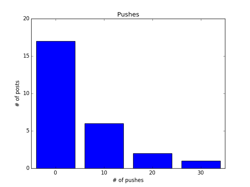
除了直接計算統計數據,將資料視覺化也是幫助我們認識資料的好辦法,例如我想知道推文數的分布,可以試著畫出 histogram, 把小於 10 推, 20 推, 30 推的文章數量以條狀圖顯示
def decile(num):  # 將數字十分位化
    return (num // 10) * 10

from collections import Counter
histogram = Counter(decile(push) for push in pushes)
print(histogram)
# Counter({0: 17, 10: 6, 20: 2, 30: 1})

# 畫出 histogram
from matplotlib import pyplot as plt

plt.bar([x-4 for x in histogram.keys()], histogram.values(), 8)
plt.axis([-5, 35, 0, 20])
plt.title('Pushes')
plt.xlabel('# of pushes')
plt.ylabel('# of posts')
plt.xticks([10 * i for i in range(4)])
plt.show()
另外,也可以考慮直接畫出資料的散佈圖 (scatter plot),觀察相關性
plt.scatter(images, pushes)
plt.title('# of image v.s. push')
plt.xlabel('# of image')
plt.ylabel('# of push')
plt.axis('equal')
plt.show()
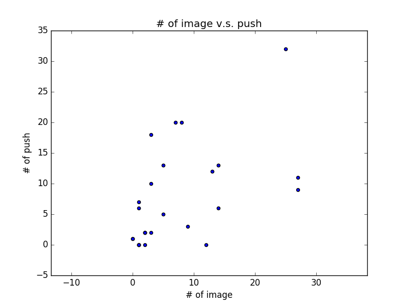
從 scatter plot 我們可以稍微看出圖片數與推文數的正相關性
結語:資料科學的三個面向
從這系列的文章,相信你已經看出所謂的資料科學與資料分析,其實可概分為三個面向:
- 資料處理,寫程式,架系統,對應資料的來源、儲存、處理、查詢等,
- 統計分析,數學,各種機器學習模型與技巧
- Domain knowledge,也就是到底要對著資料問什麼問題
所以如果你對資料科學有興趣,你可能是對架構系統有興趣(提供乾淨資料),或對於玩資料有興趣(喜歡統計分析,精通機器學習,或是有足夠的領域知識發掘好問題),也可以思考以你的背景從哪一塊切入會比較適合。
